This guide discusses dark mode, including what it is and how you can ensure that your emails are displayed correctly for those using it.
What is dark mode?
Dark mode is a setting that changes the colors of an interface to make it easier to read. The background becomes dark, and the text becomes white. The primary benefit of this is to reduce eye strain on the viewer. Dark mode is also said to reduce battery usage.
Developers are likely quite familiar with dark mode since it’s been a popular way to view code for several years. Dark Mode is also beneficial for people with light sensitivities or who work at night because it is easier to read in dark mode within a low-light environment.
Some popular applications have a dark mode option for their user interface, including email apps. But email clients must handle dark mode differently, which is where the challenge comes in.
Dark mode challenges for email marketers
When you turn on dark mode, the email application's user interface may switch. But some email clients also change the look of the entire message. The color-checking script looks at any color or background color with a CSS property of background, color, background-color, or an HTML attribute of bgcolor or color.
Put simply, dark mode changes the background and font colors of emails to be lighter when they are viewed on a dark screen.
"Okay," you may be thinking, "so let's just change the fonts to help this transition work for dark mode." Well, unfortunately fixing this issue is not quite that simple.
Plain text emails, which feature black text on a white background, typically encounter no issues in dark mode. However, when emails are developed in HTML, things get much more complicated.
How to prepare emails for dark mode
While many people view emails in dark mode, not every one does. So, the first challenge marketers face is to develop emails that work for both dark and light modes. Here are a couple best practices to adopt.
Switch out JPEGS for PNGS
If you use transparent PNGs for your images, the background color change in dark mode will be seamless. This way, the background of the image will always match the new background color.
But you still must prepare for black text and icons.
White strokes, black design elements
Sometimes, dark mode emails can cause your campaigns to disappear. This happens when black text, icons, logos, and more become invisible against dark backgrounds.
Adding white strokes around text and icons is an effective way to make your emails more digestible. When people view your email in light mode, the white strokes won't be visible. But when they view it in dark mode, the white strokes will help things stand out.
Does it really matter?
Creating emails that work in dark mode may seem like a lot of extra work. But, by not doing it, you will create emails that are either unreadable or provide a bad experience for your subscribers. Both will lead to unsubscribed and a lack of engagement with an otherwise prolific piece of your marketing strategy.
If people want to see emails in dark mode, it's better to meet their needs and provide that experience.
Dark mode and email client support
Perhaps the biggest challenge with using dark mode for email is that different email clients like Gmail, Apple Mail, and Outlook render things differently.
Some email clients invert colors automatically while others don't. Some email clients support media queries for dark and light color schemes, while others don't.
Here's a look:
- Apple Mail (iPhone/iPad)
Auto inverts colors when the background is transparent or pure white (#fffff).
- Apple Mail (macOS)
Auto inverts when the background is transparent or pure white (#fffff).
- Outlook (iOS)
May make the background color darker.
- Outlook (macOS)
May make the background color darker.
- Outlook (Windows)
This Outlook option consistently auto-inverts colors.
- Outlook.com(webmail)
This is the only Outlook option where image swap works.
May make the background color darker.
- Gmail (Android)
Auto inverts colors.
- Gmail
Does not auto invert.
- AOL (webmail)
No current dark mode user interface.
- Yahoo! (webmail)
No current dark mode user interface.
If someone is using a different operating system or device, it can make it harder to use dark mode for email. That's why it's helpful to test how your campaigns will look on different devices and operating systems. This way, you can see what works and what doesn't before you send them out.
How to test emails for dark mode legibility
Testing sounds pretty easy, right? Send yourself an email, make sure everything looks good and works, and boom! tested. But...as with everything with dark mode, it's not quite that simple. Frustrating, right?
Let's see if we can ease some of that frustration.
1. What email clients do your subscribers use?
Check which email clients your email subscribers use most. And test your email template on those email clients first.
2. Turn on dark mode
Before sending test emails, activate dark mode on your device.
3. Send the emails to yourself
Send the emails to your own account (or a test account). Compare the original with the dark mode. How does it look? What needs to change?
5. Make changes, try again
In a manual testing process, it's vital to use trial and error. Testing the emails across different clients, in different modes, and on different devices. This can take quite a while. Hopefully, after a few months of testing, you can better understand what works and what doesn't.
6. Try a dark mode tool instead
The most efficient way of testing your email is to plug it into a dark mode testing tool. Some email marketing programs and apps provide this service. For these, you can plug your email into the tool, and it will show you the different preview modes and where any deficiencies may lie. Instead of sending (and resending) emails to yourself and checking different devices, it's all in one place.
Do you have any tips on designing for dark mode?
We certainly do and we're happy to share! First and foremost, here are some helpful resources about the relationship between email development and dark mode:
- Dark Mode Design Best Practices from the BEE Design Blog (2022)
- 5 Tips for Dark Mode Email Design from the BEE Design Blog (2020)
- The Ultimate Guide to Dark Mode for Email Marketers from Litmus
- Dark Mode for Email: What it is and How to Cope from Email on Acid
- Dark mode in HTML email from Sidemail
Litmus just published a guide for programmers: How to Conquer Coding Emails for Dark Mode: A Guide For Email Developers
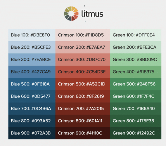
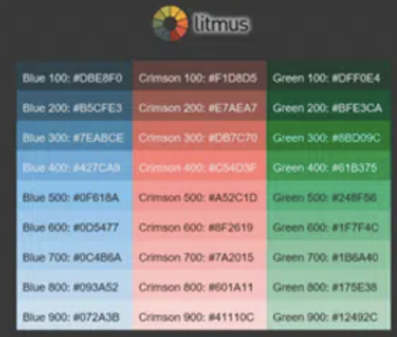
Here are two images that speak for themselves:


Developer-speak for supporting dark mode
If you or someone on your team is a developer, there are two ways you can change the colors in your emails to be darker. Dark Mode will work differently for different email clients. But if you want to use your own dark mode colors, you can.
@media (prefers-color-scheme: dark)
You can use this method to create a custom dark mode theme for your website. This is similar to using a block of styles inside a @media query for your Mobile Responsive view, except this CSS block will work for any user interface that is set to Dark Mode.
@media (prefers-color-scheme: dark) allows you to change different aspects of your website, like the images and the background, when someone is using Dark Mode.
[data-ogsc]
This method is used to target the Outlook app. With the @media (prefers-color-scheme: dark) styles, you can now add the appropriate [data-ogsc] prefixes to each CSS rule.
Testing your email in dark mode can be a tricky process, but with the right advice, it can be manageable. We hope our tips will helped you understand what to do when testing your emails for dark mode. If you're looking for more help or want to try out a dark mode tool, we suggest checking learning more about the capabilities of Cakemail.


